Sofia Martinez

Wellness on demand,
a platform that evolves with you
Product Designer | UX Strategy | Design Systems | Accessibility

Wellness on demand
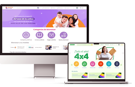
Since November 2025, I have been leading the comprehensive transformation of the Compensar On-Demand Wellness Platform, a digital ecosystem that directly impacts more than 298,000 users. The project arose from the critical need to reduce the visual fragmentation and high cognitive load of the previous model.
The project's objective is to evolve the platform into a system of personalized "Worlds," thematic environments that use advanced segmentation logic to curate the offerings. Furthermore, a customizable design is planned for the corporate (B2B) environment, allowing companies that subscribe to wellness programs to adapt the interface to their brand colors and view only the services they have subscribed to. The goal is to deliver an intuitive and scalable experience that optimizes conversion and strengthens customer loyalty through a 100% digital and human-centered navigation.
From the end of 2024 to the beginning of 2025
My role
As a Senior Product Designer, I lead the end-to-end product strategy. My responsibilities range from translating business objectives into scalable information architectures to high-fidelity visual execution.
I lead the creation and governance of the Design System, ensuring strict compliance with WCAG 2.2 accessibility standards. I also orchestrate technical alignment with the architecture, development, and analytics teams to guarantee that data-driven personalization translates into functional and efficient interface components.
Solutions Lead
Team
Solutions Lead
Yolima Segura
UX/UI Lead
Sofia Martinez (Me)
Product Owner Compensar
Lorena Jiménez
Solution Strategists
John Milan
Business Analyst
Sandra Benjumea
Cross-Functional Technical Lead
Carlos Rojas
Front-end Developer
Juan Cano
Front-end Developer
Yulieth Zuluaga
Back-end Developer
Jose Ruiz
Back-end Developer
Santiago Cano
Mobile Developer
Marlon Vargas
QA Analysts
Johana Peña
QA Analysts
Harold Calderón
The challenge
The platform operated as a generic catalog with critical friction points on two fronts:
-
B2C (Consumers): Cognitive overload, weak hierarchy, and lack of pricing clarity, causing distrust and abandonment.
-
B2B (Businesses): Unrestricted color customization, breaking visual consistency and violating accessibility standards (WCAG 2.2).
Restructuring the information architecture to transform this ecosystem into a predictive user experience and a secure corporate personalization model.
Design process
Through an end-to-end design process, we transformed the complexity of this dual ecosystem into an intuitive solution. Below, I detail how we evolved from UX research to identify critical pain points, to the ideation and implementation of a design system and WCAG 2.2.

Empathize
Understanding a dual ecosystem
Cognitive overload, weak hierarchy, and lack of pricing clarity, causing distrust and abandonment.

1. The individual user (B2C) and the need for adaptation:
For the average member, the current platform felt static. We understood that the experience needed to be seamless and adaptive, using behavioral data (searches, historical preferences) to transform the general navigation into a personalized flow that anticipated their wellness needs.
2. The corporate client (B2B) and the challenge of white labeling:
Companies that purchase wellness plans need the platform to feel like an extension of their own corporate culture.

Define
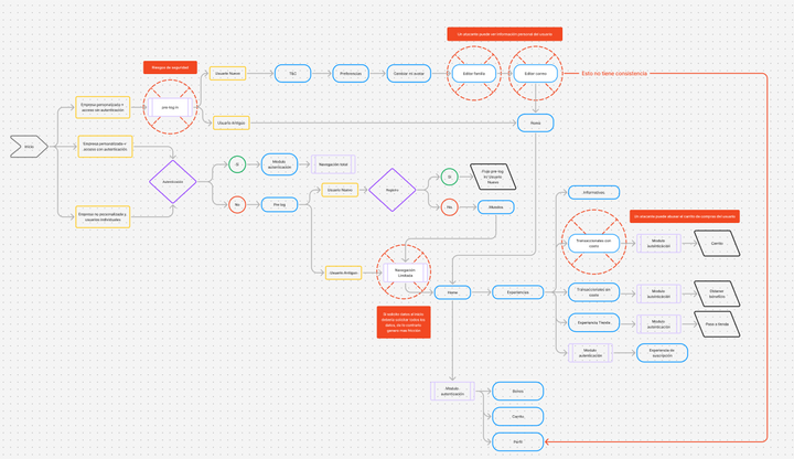
During the ideation process, we established that personalization should be proactive. We defined the concept of "Worlds" and decided to move segmentation to the beginning of the flow to filter out irrelevant content before requesting full credentials. Similarly, while auditing the "Pre-Login Experience" architecture, I identified critical security gaps and consistency issues that were refined in the user flow design.
Limited navigation?
Optimizing time to value
A key challenge was corporate (B2B) personalization. The previous model was "completely open": the client chose the primary and secondary colors, background, card background, titles, and card text. Analysis revealed critical accessibility flaws.

After many sessions, I proposed a paradigm shift. In the new model for the MVP, we provided a palette of six base colors. The user selects only one primary color, which guides the interface with a monochromatic logic, ensuring compliance with WCAG standards and the scalability of the design. We maintained key identity features: the ability to add base images for banners and the company logo, ensuring brand identity while maintaining design control and native accessibility.


Design
Data-driven (desktop-first) approach:
We began the conceptual and high-fidelity design from the web (desktop) version, responding to analytics that positioned it as the most used device by our user base.

Base design system:
We built the structure of a platform-agnostic design system based on Material Design principles, but incorporating custom components adapted for iOS. This strategic decision allowed us to ensure cross-platform consistency and scalability, facilitating implementation and accelerating the delivery of components in Flutter.
Multichannel and B2B adaptation:
From the validated web proposal, we derived the native design for the mobile app and structured the variable logic for the B2B Customization Proposal (white label for companies), ensuring that the design responded to different environments without breaking the main structure.


Testing
Validation was carried out in two phases:
-
Focus groups and stakeholder review.
-
Structured surveys and usability testing (A/B testing) with real users.


Architecture and Readability:
70% found it easier to navigate using a top bar (tabs) instead of dropdown lists
Visual cleanliness and interaction:
75% intuitively understood that the cards were interactive (clickable), allowing us to clean up the interface by removing redundant buttons.

Transparency in intermediate flows (critical iteration):
During testing, we discovered a mistrust bias (70% friction) when proceeding to checkout. In the Compensar Store experiences, the system couldn't return the exact price. To unlock the conversion without altering the technical architecture, we iterated the interface, displaying:
-
Price ranges (in money and points)
-
We implemented a proactive and personalized disclaimer to manage expectations:
"The price to pay has been automatically calculated based on your membership category (Category B). The final price of this experience will be confirmed once you continue the purchase."
This strategic transparency mitigated uncertainty and generated the necessary trust to proceed through the flow.
-
We changed the CTA text from "buy" to "continue with purchase."

Conversion and pricing architecture:
We optimized inventory visualization by unifying fragmented vouchers (e.g., Falabella vouchers of $20,000, $30,000, and $50,000) into a single experience card. By implementing a dynamic value selector, we significantly reduced cognitive load and simplified the search process—a model that 80% of users found highly intuitive.

Project results and current status
Currently in the roadmap structuring phase, we have completed the strategic design stage with critical milestones approved by the business. We transformed a legacy platform (launched in 2022) lacking standardization, creating the first platform-agnostic Design System optimized for Flutter. We evolved the experience towards a predictive model (Worlds), eliminating years of technical debt and delivering a ready and validated end-to-end ecosystem (App, Web, B2B) for over 298,000 users.
Time to Value
135
Optimization of steps in the initial flow, moving from a restrictive model to a predictive one.
UI operational efficiency
50%
With projected reductions in design time, standardization allows the team to focus resources on strategy and accelerates time-to-market.
Lessons learned
This project provided me with two major strategic lessons.
-
Adaptive Architecture: For over 298,000 diverse users, generic design simply doesn't work. The solution was the "Worlds" approach: a single structural foundation that proactively reconfigures itself based on user profile.
-
Paradigm Shift: In traditional companies, a Design System isn't sold based on its aesthetics, but rather on its "operational efficiency." Demonstrating its impact on performance (Flutter) and accessibility (WCAG 2.2) was key to its approval.
Thank you!
Credits

